|
|
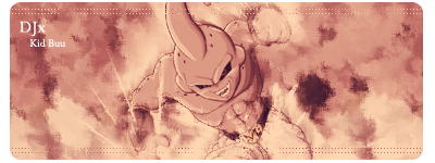
It's good but the text stands out more then the render itself. Which is usually your point of interest. Maybe lower the opacity on your render and blend the text a bit more.
You want your eye to be naturally attracted to the render. A trick to do this is if your using photoshop doing filter>blur>blur or even filter>blur>blur more. on your background effects and text. this will trick your eyes into focusing on what you haven't blurred without people actually noticing the blur itself.
|
| |
|
|
I totally understand what you mean. I was just making this sig and somehow the render just didn't pop out as I expected. If you look at my first sig in the older sigs spoiler, you'll see what I was trying to make, but I kinda failed. And now I look at that sig and realize the border is ugly and the text too lol. I suck at text *Okay face*

Tnx for tip btw. I guess I'll try again tomorrow.


 253
253